Logo Design / Brand Development
NZCGE launched a campaign in early 2023 to raise an additional $10m from government and philanthropy to fund specialist support for 10,000 neurodiverse students and 500 schools. The search was on to find 15 Young Neurodiversity Champions to stand up at Parliament and tell their stories.
Our objective was to create an identity that would engage, unite, and energise our Young Neurodiversity Champions. We drew upon the infinity sign, the universal symbol for neurodiversity, crafting it into a contemporary, bold, and playful ‘N’ to denote the neurodiverse in Young Neurodiversity Champions. The full spectrum of the rainbow, once again a neurodiversity symbol of inclusion and diversity, adds a vibrant and celebratory quality, either as a secondary element or incorporated into the logo mark. The deep royal-blue offsets the vibrancy and imbues a more serious tone that reminds us that there is important work to be done.
DINZ Best Awards
2023 - Public Good Award - Finalist
Logo Design / Brand Development / Copywriting / Photography
Based in Wellington, The New Zealand Centre for Gifted Education (NZCGE) had evolved through the amalgamation of two organisations - The Gifted Education Centre and The Gifted Children’s Advancement Charitable Trust. NZCGE combines the strengths of both former organisations offering five services; Gifted Kids, One Day School, Tall Poppies, Gifted Online, and Gifted Kids Consult. The merger created the perfect opportunity to develop a cohesive brand that encompasses the passion and purpose of the organisation – Empowering Extraordinary Minds.
DINZ Best Awards
Small Brand Identity - Gold
Brand Development / Graphic Design
Woods Glass wanted to refresh their overview brochure to appeal to and engage architects and developers. The redesign required plenty of white space and solid grid to hero the incredible project photography while clearly conveying Woods Glass’ capabilities.
Logo Design / Brand Development / Photography
DMRP (Don't let your Mind Rob your Potential) is a faith based streetwear label that challenges the mindsets and attitudes of its market through brand culture. When the owners aren’t busy working on the business, they are working within local communities, feeding the streets on a weekly basis, delivering food parcels, sowing into youth creative and design programmes, and providing free coaching for those who are ready for change.
There was an opportunity to give back to DMRP and take their brand to a whole new level. I refreshed their identity and took their photography onto the streets of Auckland.
Logo Design / Campaign Design / Photography / Copywriting
In 2013, Carter Holt Harvey requested a brand revitalisation of their Bestwood brand. Bestwood was a founder of the modern decorative panel in New Zealand, however, in recent years it had lost market share to existing competitors. After the successful logo redesign and launch, a series of new and exciting panel products were introduced into the market. The image shown here, showcase Bestwood’s Colour Range of veneers.
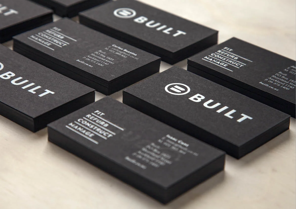
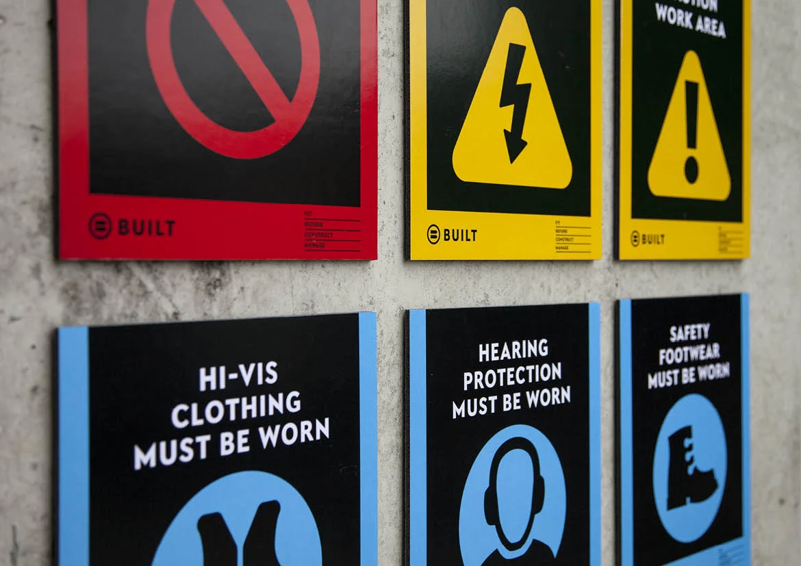
Logo Design / Brand Development
Built is a commercial office and retail space fit-out specialist. Experiencing growth, Built needed a contemporary and professional identity that would appeal to architects and corporates. From the website and site signage through to promotional sweets, the new branding was applied consistently, creating a strong presence in the fit-out sector.
DINZ Best Awards
2014 - Small Brand Identity - Finalist
Logo Design / Branding Development
Multiples NZ is a nationwide, parent-led, not-for-profit supporting families in their journey from expecting to raising multiples. With the number of multiple births growing in New Zealand year upon year, Multiples NZ wanted to raise the professionalism and profile of the organisation.
Together, we identified three key concepts that would guide the development of the brand: gentle, credible, contemporary.
The new identity was created with this in mind.
Graphic Design
Carter Holt Harvey wanted to create a look book showcasing Shadowclad that would appeal to architects and specifiers.
Winstone Wallboards wanted to launch a new prefinished wall lining into the market. The brief involved creating and implementing a brand strategy which included the naming of the product, messaging, copywriting, identity, advertising, digital communications, packaging and a series of launch and industry events.
The key to ensuring a successful launch was understanding the two main target audiences. Firstly, it was critical to educate specifiers, including architects and interior designers, to inform them of the benefits and aesthetic value of the new system. This would stimulate interest and adoption. Secondly, it was important to get ‘buy in’ from the commercial installers, to raise awareness and provide training so installers felt they were valued and that GIB (an industry leader) was committed to the system. It was also important to stress that this was a system that would give installers an alternative, and quicker, method of revenue.
DINZ Best Awards
2013 - Small Brand Identity - Finalist
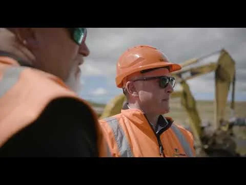
Storyboarding, Art Direction, Photography
EnviroNZ is an innovative waste management and resource recovery company working in partnership with New Zealand’s government bodies, communities and businesses.
EnviroNZ required a video to attract potential employees to the waste sector. By showcasing our operations, company vision and culture I was able to break down some of the misconceptions that surround the waste industry.
Filmed over three days, the storyline depicts ‘a day in the life’, from a collection vehicle drivers perspective right through to the current CEO.
Logo Design / Brand Development / Packaging
CRC wanted to create a car care brand that would stand out from the crowd and appeal to 17-30 year old males. The brand needed to be unique, powerful and an extension of the consumer’s self expression.
Carefully referencing hammer-horror visual cues this direction uses the tension between a lively palette and symbolically rich marks to pull the viewer in. The clean word mark acts as a stable anchor while the dynamic visual elements forge a brave new language in an otherwise literal and predictable category.
Campaign Strategy / Graphic Design / Copywriting / Implementation
With Auckland Council exiting the North Shore bag market, and no other brands in the given product category, EnviroWaste saw an opportunity to grow market share.
Instore activations were conducted at supermarkets to target habitual buyers of prepaid plastic bags, raising awareness of the EnviroWaste prepaid bag and counteracting the launch of the Council’s wheelie bin and tag service. Additionally, a DM mailer containing a prepaid plastic bag was delivered to 30,000 households, allowing residents to trial the service for free. New customer details were captured via a SMS call to action which activated the service.
OOH channels, such as bus and banner advertising were also utilised to maximise brand awareness.
Overall, the campaign increased market share by 26%.
Copywriting / Graphic Design / Photography